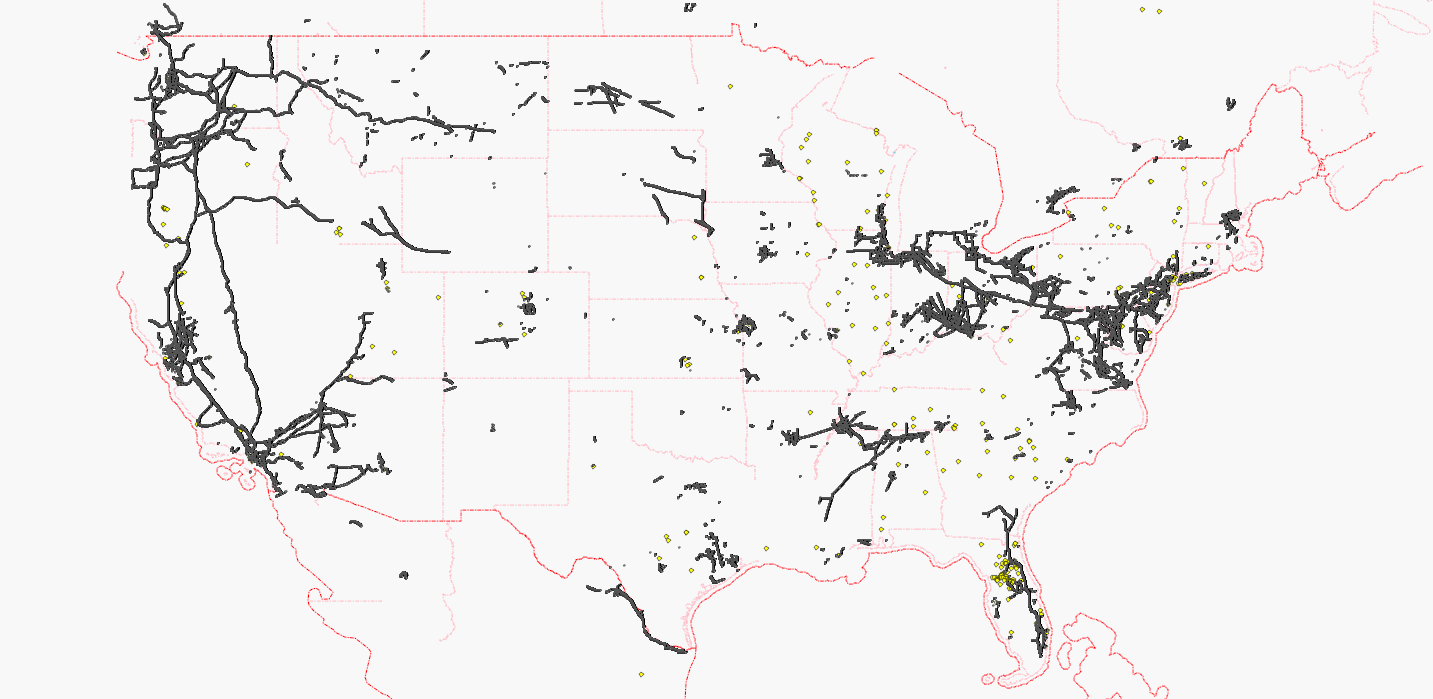
Each black dot represents a pylon, each yellow dot represents a substation node.
White areas are still looking for active mappers, of course.
Maps have been updated on:
osm.wiki/WikiProject_Power_networks/United_States
The powermap is updated on request:
http://toolserver.org/~osm/styles/?layers=B000F0FF0000F0FFF0000T&zoom=10&lat=41.8083&lon=-83.66106
讨论
iandees 于 2011年03月 9日 11:51 的评论
Your map is still incomplete: the majority of power station/sub_stations are mapped as areas, not nodes. At least put a dot on the map for the first node in such a polygon. Also, as others have mentioned before there are plenty of power=line that don't have power=[tower/pole] marked on their nodes (since it's so tedious in all the editors).
SK53 于 2011年03月 9日 12:00 的评论
Agree that this map is misleading.
A substantial number of power-lines have been edited and tidied up since the TIGER import (e.g., NW PA), at least in part because they show up clearly on the dupnode map and can easily be cleaned-up without interfering with anything else.
42429 于 2011年03月 9日 13:44 的评论
This map is intended to attract new mappers for some neglected areas. Since October 2010, this power network has grown remarkably, and each additional line may be considered as success.
This map is neither a proof that black areas are perfectly mapped (Chicago has still some gaps which need to be added) nor a proof that white areas are completely unmapped. Toolserver's powermap has almost as many white spots as my simple map which I have made with Kosmos, so there must be some untouched areas.
Anybody who wants to fill the white areas is welcome. Anybody who wants to leave the map as it is will be ignored.
nmixter 于 2011年03月 9日 22:16 的评论
Too bad there aren't any national power line data sets that could be imported. Bing imagery makes it a little easier follow power lines around.
bahnpirat 于 2011年03月17日 08:20 的评论
The "world map" you may searching for is here:
http://energy.freelayer.net/?layers=000B0000T
For now it's only down to z10. Or if you change the layer it's down to z12 for Europe. Improvement's are planed till end of march 2011. Update march 1, 2011; rendered with Maperitive.