Displaying accessibility information in map icons
Publikigita de SomeoneElse je 19 februaro 2020 en English.For some time I’ve been experimenting with how other information can be added to established icons. For example, here’s how I’ve been representing various tourist information items:

In those examples there are only two pieces of information - that it’s something to do with tourist information, and whether it’s a board, guidepost, plaque, etc.
With pubs, I already show several sorts of information together. For example this one:
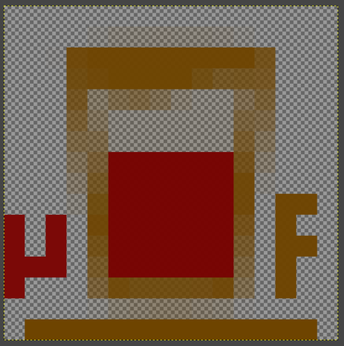
is a pub that’s open (it’d have a cross in the middle of the beer glass if it wasn’t), serves real ale (you can tell from the maroon liquid in the glass), is a micropub (the μ at the left shows that), serves food (the F at the right) and has a noncarpeted floor that means if you’re wearing muddy boots you don’t need to take them off before going to the bar (the brown underline).
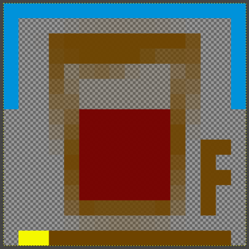
A couple of other modifiers are also available - here’s a map showing a pub with a blue “roof” that offers accommodation as well as food:
I thought that it was possible to also show the values from a “wheelchair” tag, so I added that at the left-hand side of the “floor” bar:
Here yellow is used for “wheelchair=limited”, green means “wheelchair=yes” and red for “wheelchair=no”. If there is no wheelchair tag the original icon is used.
Obviously, specialist maps such as wheelmap already exist for this sort of thing, and they can provide much more information (e.g. nearest wheelchair accessible toilets), but there’s no reason why a more general map style can’t show this sort of thing too.
Here’s an example of what the resulting map looks like. The extra colour is deliberately not intrusive but is designed to be visible if you’re looking for it.
Diskuto
Komento de Glassman je 20 februaro 2020 je 00:52
Good concept - adding information that can quickly be discerned by the user. I really had to squint to see the red bar under Moors Inn. Would having a border around the icon in red/yellow/green help?
Working with the University of Washington’s Taskar for accessible technology routing may also be part of the solution as well. Your solution tells the person right away if they should even consider going there.
Keep up the good work.
Clifford
Komento de SomeoneElse je 21 februaro 2020 je 00:21
It would - and one of the problems that I’ve spotted elsewhere is that the name is currently displayed quite close to the bottom of the icon, which means a “b”, “d” or “h” can have the upstroke obscure the indicator. However, part of the idea was to make the “wheelchair tag” visible, but not the “most obvious thing” about the icon as displayed. I’ll possibly experiment with slightly larger ones, or differently placed ones.
Komento de robbieonsea je 21 februaro 2020 je 19:10
That’s a lot of pub icons!
Did you generate these manually?
Komento de SomeoneElse je 22 februaro 2020 je 10:00
It’s a lot of icons but not a lot of pixels - it doesn’t take long to take 3 copies of an existing icon and dab in two dots of green, yellow or red.
The original pub icon was an old OSM Carto one - that started out as an empty beer glass, with the other features added to that.
Komento de robbieonsea je 22 februaro 2020 je 12:25
It would be interesting if these could be generated programmatically and more importantly then used directly within carto/mapnik somehow. Mapnik supports some level of .svg for Point/Marker symbols, so perhaps another level of code generation. Thus no doubt much more complicated to get it working for the first time if no-one has done something like this before.
Komento de SomeoneElse je 22 februaro 2020 je 22:29
Although it’s not that that time consuming to create a few more icons that differ only slightly from the originals, it would be interesting to be able create at least some of the variations automatically.
I think that Imagemagick supports scripting (though I’ve never used them with it), and I’ve no idea if it supports things like “change pixel x, y to colour z”.
Komento de grouper je 2 marto 2020 je 16:34
Could Postgis raster functions do the trick for automation?
e.g. RT_ST_SetValue()
https://postgis.net/docs/RT_ST_SetValue.html
Komento de trial je 6 marto 2020 je 14:56
Use a wheelchair or be colorblind, but not both? Think about colors for colorblind people for accessibility.
Komento de SomeoneElse je 6 marto 2020 je 17:50
@trial I’ve no idea what your link is supposed to show?
On the more general point - no, common forms of colourblindness were not taken into account when choosing the colour palette used, mainly because pretty much every possible colour variation is in use for something. If you can suggest how to show the same variation of information and make it work for people who are colourblind as well that’d be great - the best way to start would be by opening an issue explaining what you propose to do, and then if that sounds sensible pull requests as necessary.
Komento de trial je 6 marto 2020 je 18:08
The link shows 3 colors that are valid color for color-blind people, it was about:
Another possibility is to use a number of dots as scale (0 dot=0 1 dot=restricted, 2 dots=yes).
Komento de SomeoneElse je 6 marto 2020 je 20:36
Ah, OK. A problem would be that there are many more than 3 colours in use - if you look here you can see a selection of them.
Something like that would be a possibility (but with 4 states not 3 of course - “don’t know, no, restricted, yes”). The wheelchair indicator is already intentionally not “in your face” - you can use two fingers on a leaflet map to quickly magnify a section, and there it might be possible to count 0,1,2,3 or 4 pixels.