Dieser Eintrag ist auch auf Deutsch verfügbar.
The excellent JOSM-Editor offers the possibility to change the way how the map in the editor looks. Apart from line styles and polygons POI icons form a major part of the default style.
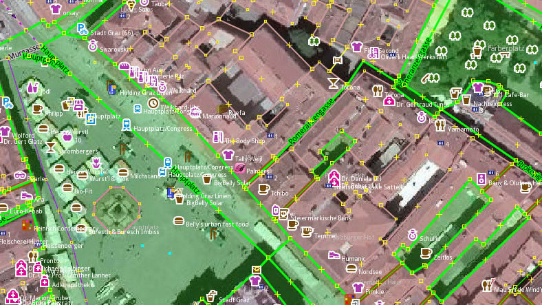
I have created a style for JOSM that substitutes default POI icons with icons from Osmic. Here is an example:

Have a look at the project repository: https://github.com/gmgeo/osmic-josm-style
The style uses most of the 149 currently available icons from Osmic and re-uses the colour scheme used by osm.org’s default style openstreetmap-carto. What I’m trying to achieve is more visual consistency between the individual POI icons.
I’m also trying to increase familiarity between JOSM’s style and OSM’s default map style, which might be helpful when editing. Since openstreetmap-carto also uses many of Osmic’s icons making the connection between POI features on the slippy map and in the editor should be easier.
The style is easily enabled from within JOSM by following this guide. The name of the style is Osmic. Please note that this style only substitutes POI icons and you will still need to have the JOSM default map style (or any other) enabled.
Your feedback is welcome.
Фекер алышыу
Marián Kyralтарафынан18 September 2015 cәғәт 05:00көндө ҡаралған
Nice.
Yarlтарафынан22 September 2015 cәғәт 12:12көндө ҡаралған
Looks very good. There was, however, an opinion on Polish forum, that outline is little bit too prominent.
Do you plan to merge this style with JOSM core?
nebulon42тарафынан22 September 2015 cәғәт 18:07көндө ҡаралған
The outline is a compromise between the dark style without aerial imagery and the noisy background of aerial imagery. On the dark style without aerial imagery a semi-transparent halo very quickly starts looking dirty-greyish. Since you already have experience with tweaking icons for JOSM I would be happy if you or someone could help with finding the best-looking alternative.
I guess you mean if I have plans to make this the default style of JOSM? No, currently not. However, if somebody wanted to push it in this direction this would be ok for me and I would support it. I’m sure you have noticed that this style does not cover all icons currently supported by JOSM, so there would still be some work to do.