
Exactly one year ago I published my first visualization of the global OpenStreetMap data density. This is the updated 2014 edition.
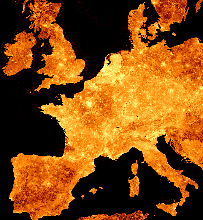 (click image for slippy map or here for high-res images)
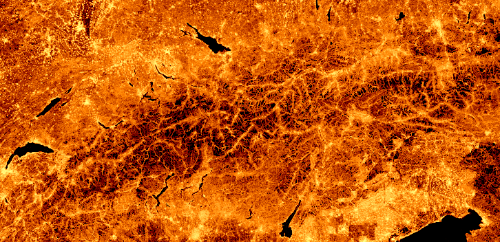
Each pixel shows the number of nodes in its corresponding area¹. But this year every point that has data in it is shown (i.e. there is at least one node at that location - last year only locations with more than 1000 nodes were included). Also, the slippy map has two more zoom levels which reveal even more impressive details like on this crop of the central Alps:
Here is a low-zoom image of the whole planet:

¹ Yes, this is Mercator map tile area, not actual on-the-ground area. Keep this in mind when comparing regions at different latitudes!
² Copying: visualizations © Martin Raifer, CC-BY - source data © OpenStreetMap contributors, ODbL
PS: The visualizations are based on a planet file I downloaded one or two weeks ago. It was processed using some custom scripts based on node-osmium, the graphics were made with gnuplot (just like last years’) and finally the map tiles for the slippy map were cut using imagemagick. I could probably explain the individual steps in a separate blog post, if anyone was interested - let me know!
Συζήτηση
Σχόλιο από τον/την imagico στις 27 Ιούνιος 2014 στις 11:15
Very nice. Maybe you could publish the color scales for the different zoom levels, i.e. what color represents how many nodes per web mercator square kilometers.
Converting the data to real densities should be relatively easy by multiplying with the area scaling function of the projection. This would lighten up the polar regions quite a bit, Greenland for example is is fact mapped with similar node density in the north and south.
Σχόλιο από τον/την Endres Pelka στις 27 Ιούνιος 2014 στις 14:14
Yes, please publish the individual steps. I’d like to render a similar map, but only for some smaller regions and with higher zoom levels :)
Σχόλιο από τον/την HannesHH στις 28 Ιούνιος 2014 στις 10:27
That’s gorgeous! I want that Europe image framed on my wall. :)
Σχόλιο από τον/την marscot στις 28 Ιούνιος 2014 στις 11:12
that is a great picture
Σχόλιο από τον/την grin στις 28 Ιούνιος 2014 στις 16:45
Beautiful, thank you very much!
Σχόλιο από τον/την AnnaPS στις 28 Ιούνιος 2014 στις 18:04
This is gorgeous. I’d love to see a blogpost with the individual steps!
Σχόλιο από τον/την Noro Hibu στις 12 Αύγουστος 2014 στις 07:15
I am interested. Please tell in detail how you did it)
Σχόλιο από τον/την stev στις 15 Φεβρουάριος 2015 στις 17:57
Hi,
I’m writing a thesis on whether Hadoop / other “big data” tools might be useful to analyse OSM data (https://lists.openstreetmap.org/pipermail/dev/2015-January/028227.html) so this is the sort of operation that it would be great to compare. If you have any further details about how you did it I would be much obliged.
Thanks
Stephen
Σχόλιο από τον/την Enock4seth στις 29 Απρίλιος 2015 στις 20:05
Awesome! I like it.
Σχόλιο από τον/την goclem στις 9 Φεβρουάριος 2017 στις 09:39
Thanks a lot for this map! I was wondering what was the maximum number of nodes in one pixel of your map. I understand that the minimum is 1000. Best, Clément
Σχόλιο από τον/την tyr_asd στις 9 Φεβρουάριος 2017 στις 10:01
@goclem: In this visualization (as well as the updated one) from 2016, there is no minimum number of nodes in a pixel. The maximum depends very much on the zoom level you’re looking at. Frederic’s analysis from 2013 may give you some more insight into what absolute numbers one might have to expect.